
An Apology to Rob Liefeld
Hey there internet nerds and self proclaimed comic book aficionados. I think that it’s time that we all looked deep inside ourselves and come to the sane and rational decision that it is time to stop all of the online hate and apologize to Rob Liefeld.
Background
For the uninitiated – or for those who had social lives as teenagers in the ‘90s – Rob Liefeld was one of Marvel’s super star artists. His work was flashy, gritty and everything that was printing money at the time. He revamped titles, made new characters and put an indelible stamp on the comic book landscape. He created Deadpool and Cable and was so famous that Spike fucking Lee directed a Levi’s commercial starring him.
when was the last time anyone gave a shit about your pants?
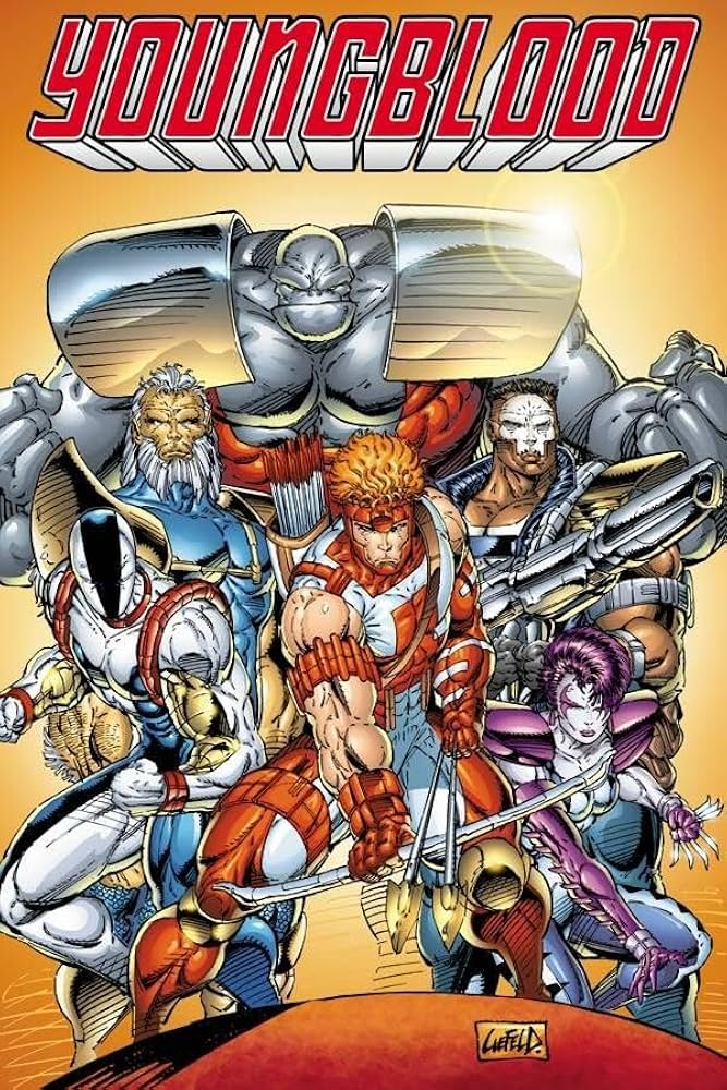
Then, at the height of his fame, he and some of his cohort – arguably the five or six most popular, superstar artists of the time – up and quit Marvel comics to create their own creator owned imprint: Image Comics. Image Comics’ first release? Rob Liefeld’s Youngblood. Which the initial mini series sold a mind warping 25 million copies.
The bottom line is that for anyone who has paid attention to comic books; Rob Liefeld is an unquestionable superstar and powerhouse. He’s also one of the most divisive and controversial artists in the online discourse. I don’t think there’s another artist that garners as much vitriol as Rob Liefeld.
To a certain extent; I get it. There are a LOT of problems when it comes to critical analysis of Rob Liefeld’s art.
The Feet
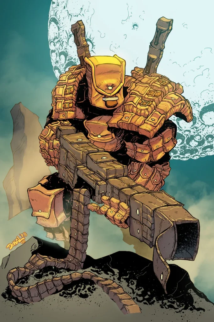
There is a common joke that Rob Liefeld does not know, nor care to learn, how to draw feet. Somehow, no matter the setting or environment. No matter the context of the story; if Rob Liefeld is drawing a cover or the interiors of an issue there will be just enough rubble and rocks floating around for Rob to hide his characters behind so he doesn’t have to draw their feet.
in this instance their feet are blocked by the curvature of the tiny planet they are on
He’s like a the reverse Quentin Tarantino in that sense. For every second of film QT has dedicated to appeasing his kink of looking at attractive women’s little piggies – Rob Liefeld has also dedicated the same amount of panels to not understanding what the fuck happens at the end of a characters legs. Is it a stump? A meat bubble? What do people put their shoes on? Who gives a fuck, there’s enough ground level smoke in this checks notes shopping mall to obscure whatever happens down there.
Not his fucking problem. You figure it out in your imagination.
The Pouches
Do you remember the first time you were introduced to the concept of Batman’s Utility Belt? It was a brilliant idea right? On his waist Batman has a cornucopia of gadgets and items that can be used to help in his quest to fight crime. Rob Liefeld saw Batman’s Utility belt and asked the question that defined comic book character design for over a decade; “What if they had that…but fucking EVERYWHERE?”
At any time any of Rob’s characters are holding the entire accessory section of an IKEA on their person. Are you looking for the corpse of Jimmy Hoffa? Pouch. Shroud of Turin? Pouch. Your keys? pouch. Have you misplaced your back pack? That mother fucker probably turned into a pouch.
FEAR THE POUCH!!!!
The Anatomy
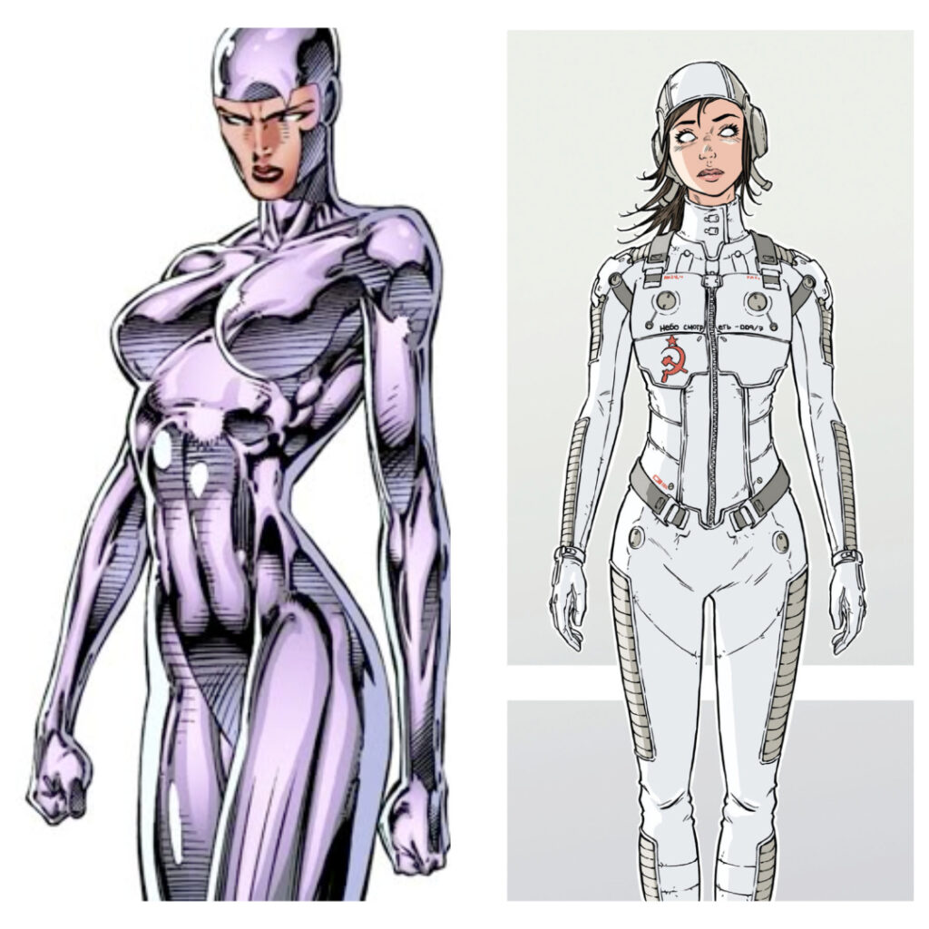
A general question that would be reasonable to ask Rob is: “Have you ever seen a human being in real life?” Because if you look at most of his work it is fairly clear that even though he is married, and has several children, he may have actually never seen a naked human being. There is a very famous picture that always circulates the internet when you talk about Liefeld’s exaggerated anatomy…the Captain America pin up.
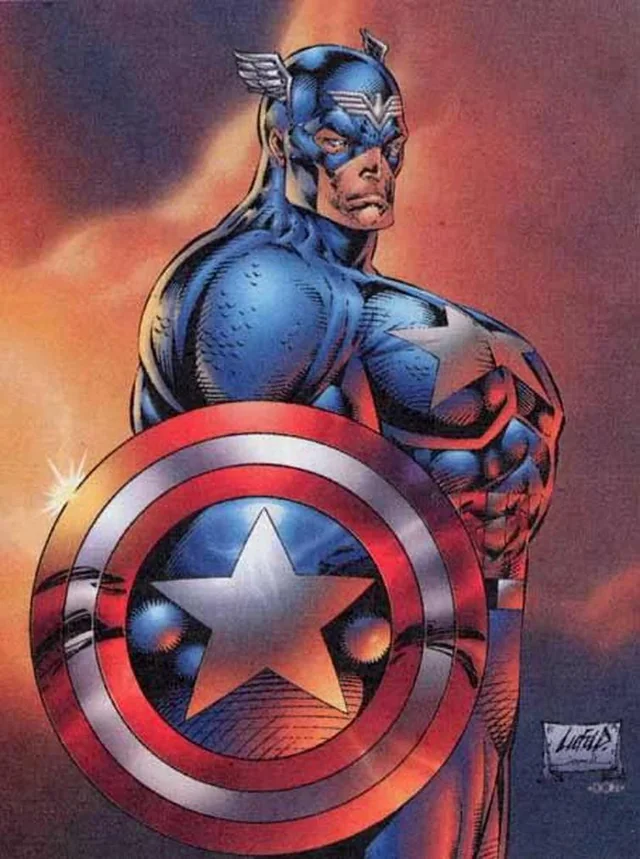
Rob is very certain that people have the basics – bones, muscles, joints, maybe feet – but he’s not really certain how all of those things are put together in order to make a human being. It’s like he got a Lego set – looked at the picture on the cover of the box, discarded the instructions and went “fuck it, close enough.”
a real(ish), human(ish), woman(ish)
The Designs
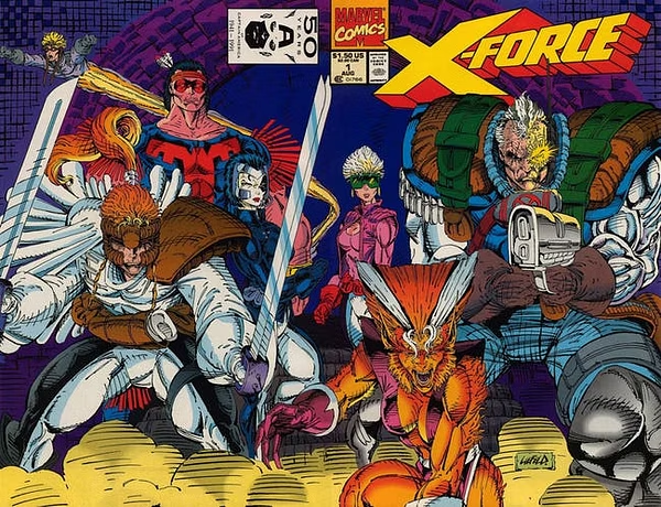
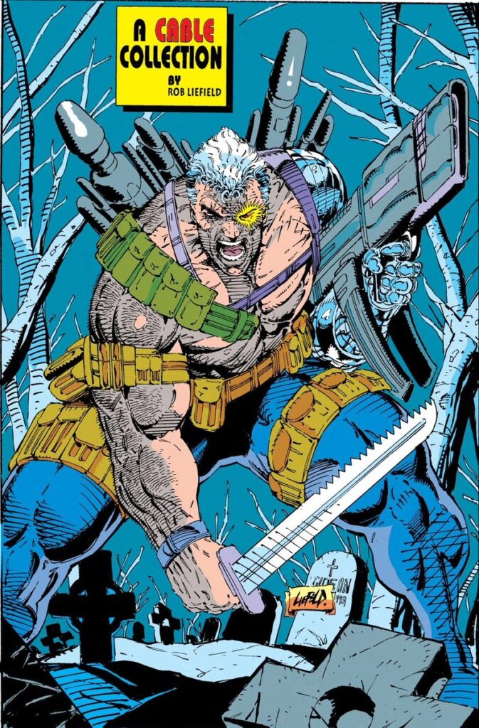
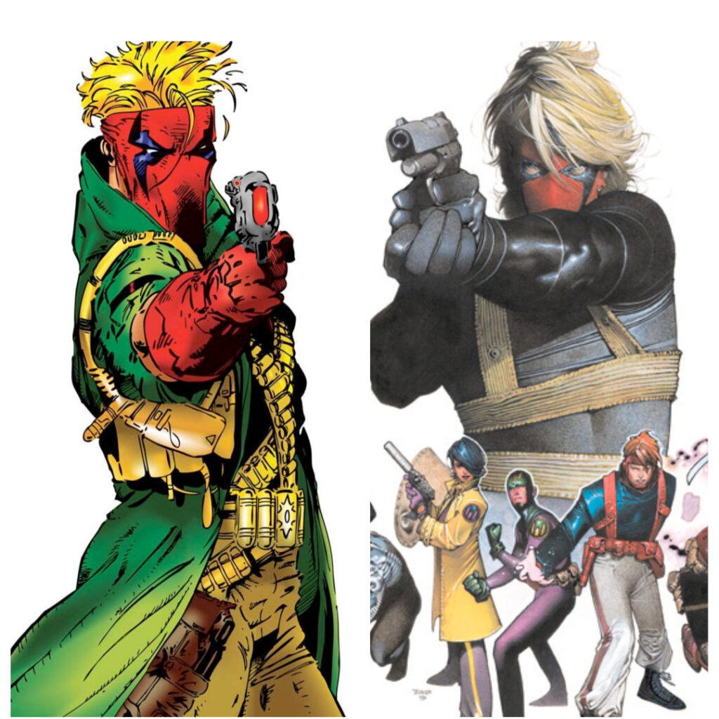
Hooo boy, this one is gonna be fun because when Rob Liefeld designs a character there is no concept of what the fuck is going to be the end result. None of his stylistic choices made any real sense. Why does Cable have gigantic shoulder pads? Why does Strife’s helmet look like he glued extra pieces of my children’s magnet blocks to a shredder cosplay helmet? Why does Chapel paint a skull on his face? He’s supposed to be a covert operative.
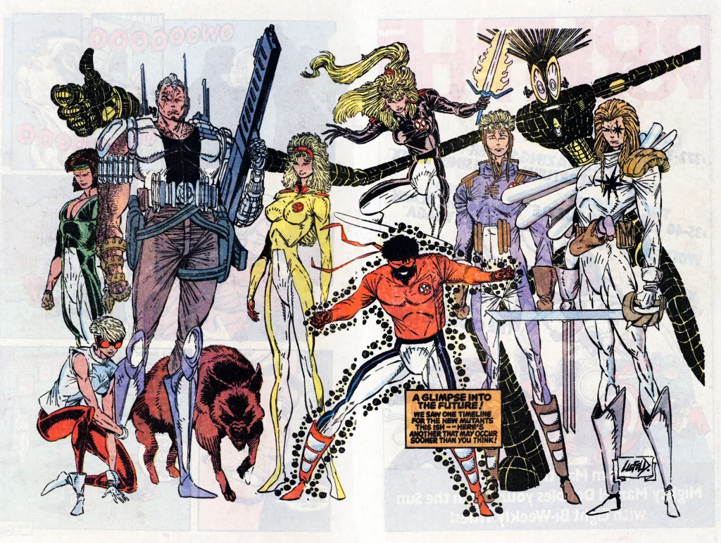
This is ShatterStar – arguably one of the more popular characters he created during his run on New Mutants / X-Force.
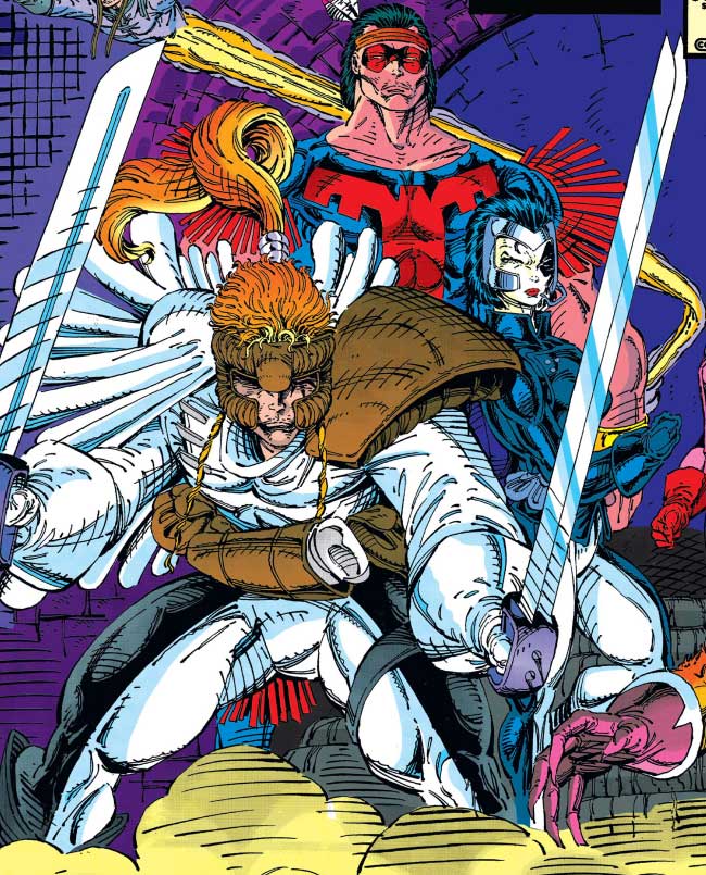
Admittedly as a twelve year old I thought this guy was so fucking cool. In retrospect I have so many questions.
- What is the helmet / gauntlet / thing on his face?
- Why does he have a single defensive (?) shoulder pad?
- What purpose does his tiny decorative cape serve?
- Why does one of his swords have two blades?
- Why does that sword shoot power beam lasers?
- What’s going on with the afro and pony tail?
- Who are you to question his aesthetic choices.
Shatterstar is only one of a myriad of mind boggling character designs that dominated his Marvel and Image comics tenures.
Ooof. Yeah.
To a certain extent, when viewed in a vacuum, and through the lens of modern comic book criticism, it is easy to find the flaws. When you put Rob Liefeld’s work into the context of the era of comic books at that time; he’s less of an outlier and more par for the course. Let’s take a brief dive into the historical landscape of comics in the ’90s real quick.
“Holy shit that looks fucking awesome! Big boobs. Big guns. Sneering good guys and bad guys. Everything is stylized as FUCK!”
And thus concludes our history lesson.
Given that context let’s address all of our critical items from above.
The Feet
It’s a cheat. Professional artists are on a constant tight deadline to turn around high quality art. Faces are important. Costumes are important. But feet? Meh. Especially in the ’90s when almost every character was wearing impossibly skin tight outfits that didn’t require things like laces or buckles. Wolverine’s boots looked like Cyclop’s boots, looked like Storm’s boots. If it shaved an hour off of a finished piece? Fuck it, throw it behind some rocks. It wasn’t just Liefeld, they all did it … even the patron saint of ‘90s comics: Jim Lee.
The Designs
Until the early 2000s we never really had to care about how a comic book character’s costume would translate to the real world. Comic accurate costumes were impossibly skin tight spandex and ridiculous accoutrements. Nothing about any comic book characters chosen costume makes any sense on any level. We accept them as artifacts of the conceit of who they are: Costumed Heroes. Artists of the time had to either adapt what had previously been established or create new characters that stood out against those that already existed. In the simpler, four color days, the printers weren’t up to the level of detail that we have today. The easiest way to differentiate one character from another was their specific color scheme or their silhouette.
- Captain America – Red, white and blue color scheme. Big round shield. Stupid wings on his head and swashbuckler boots.
- Cable – Cybernetic eye. Big ass metal arm. Lots of shoulder pads and weapons.
- Wolverine – Brown and black or blue and yellow color scheme. Blades coming out of his hands. Weird fucking fin things on this mask and, of all things, his boots?
- Spider-Man – Red and blue color scheme and those big ole ridiculous eyes.
This list could go on and on; but if you saw a silhouette group shot you could pick every character out of a line up. Rob Liefeld’s designs were in the same vein:
- Specifically colored.
- Identifiable (mostly – admittedly he did reuse some designs)
- Recognizable by their silhouette.
This was done by every artist of his generation; but no one gets nearly as much shit for it as Rob. Which is unfair and disproportionate.
Everything said above could just as easily be said about Erik Larsen; whose style has only gotten more and more esoteric over the years. Erik is also one of the founding members of Image Comics – and the only one still working in monthly comics on his original creation … 300+ issues later. There are no online discourses about the flaws in his art or style. No extensive clickbait lists of his worst drawing. It’s just okay to shit on only Rob for some reason.
The Anatomy
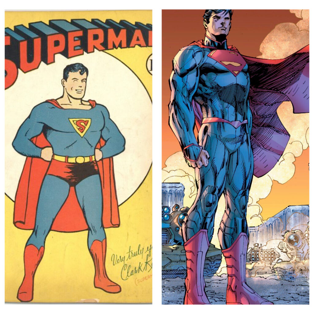
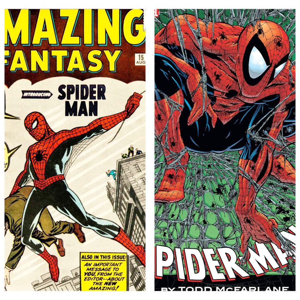
Comic book characters, as a concept, were never meant to look like real people (and we never expected real people to look like them). They are idealized versions of what we want our heroes to look like. There are horror stories from every actor who has had to play a superhero onscreen on what it took to put themselves into “comic accurate” shape. They are meant to be a caricature of human anatomy and like any iterative process the caricature becomes a caricature of the caricature over and over again. Each generation a distortion of the one that came before it.
By the time that we hit the 1990’s we’d gone through numerous iterations of superhero design and anatomy.
- Platinum Age
- Golden Age
- Silver Age
- Broze Age
- Modern Age <- Rob Liefeld and image comics start here.
- Cinema Age <- Widescreen modern comics start here
We’ve even hit the point in the timeline now where we are deconstructing not only the visuals but even the concepts of the immediately previous generation.
The point here is that the physical anatomy of these idealized characters continues to evolve and be refined year over year. Liefeld just made his bones at the height of the ultra stylized iteration. He was one among many of his peers at the time; but again all of the hate falls upon him instead of any of his compatriots of the era.
You’re not gonna like this take, nerds, but Rob Liefeld is an absolute ICON of the comic book world. Like Jack Kirby or John Romita Jr. I can spot his art on a shelf from across the room. I’m not a huge fan of Kirby or JRJR’s art (please contact my lawyer for any hate mail) but I can recognize that they are also icons of an industry that I love with all of my heart. Rob Liefeld brought eyes to the comic book industry. I got X-Force #1 as a Christmas present in 1991 and I’m not alone. That comic book sold FIVE (fucking) MILLION copies upon its release. Thirty years later I still have it in my longbox. If artists were the cocaine dealers of the comic book world in the 1990’s … Rob Liefeld moved. Fucking. WEIGHT!
It’s time that we put we some respect on his name and apologize for the way that we’ve treated him. All he ever wanted to do was make awesome shit to entertain you. Enjoy it for the absolutely awesome shit that it is. You don’t need to be a dick about it.
Travis
pew pew motherfucker